

How to Combine Prints for a Chic Look
Ever peeked in your closet and thought, "Can I really wear polka dots with plaid without looking like I got dressed in the dark?" You're not alone. Mixing prints for clothing can feel a bit intimidating—almost like you need a secret decoder ring and several Pinterest boards open at once. But the good news? Anyone can master the art of print mixing, and the result is a chic, uniquely personal look that simply can't be bought off a rack.
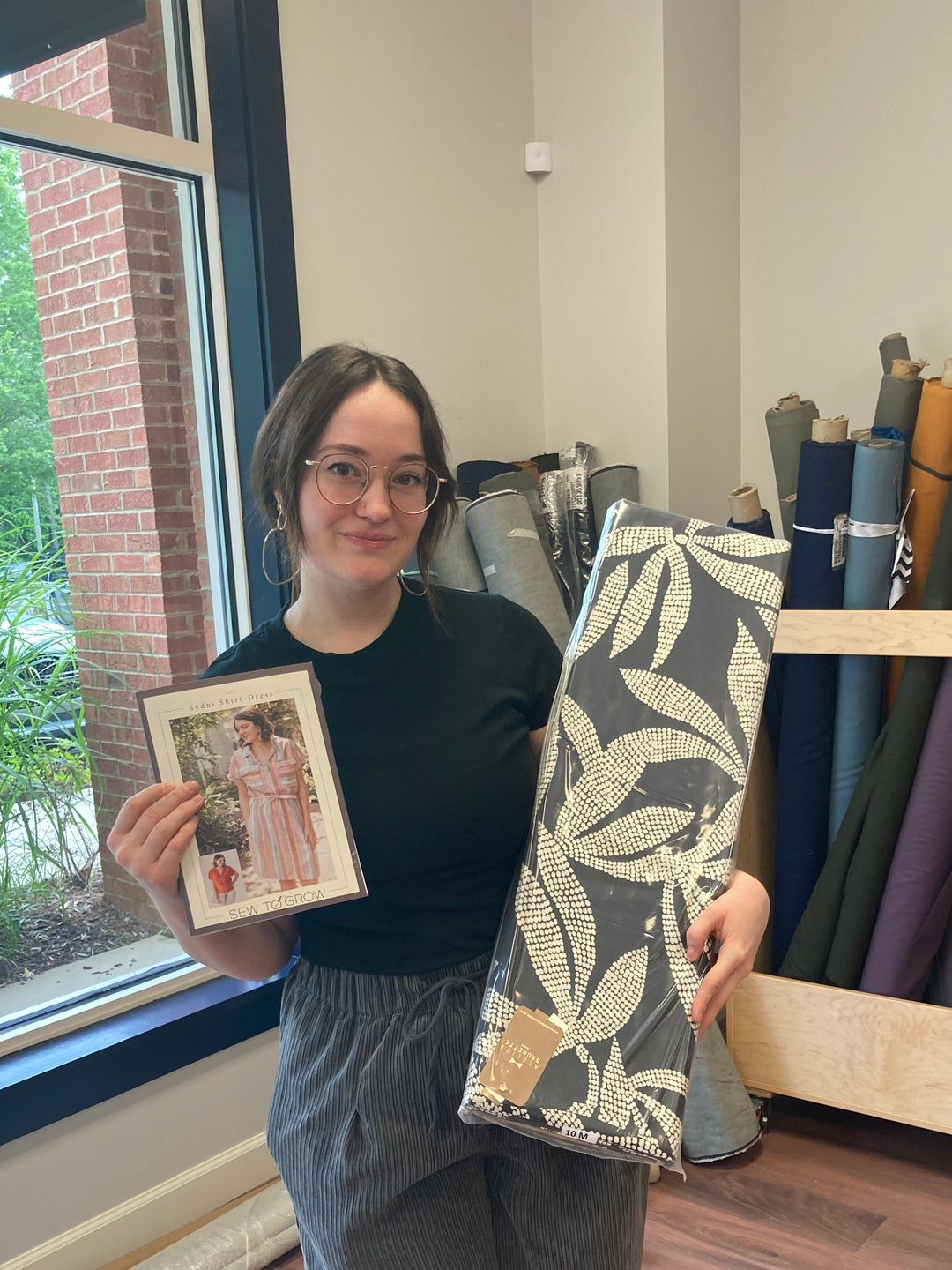
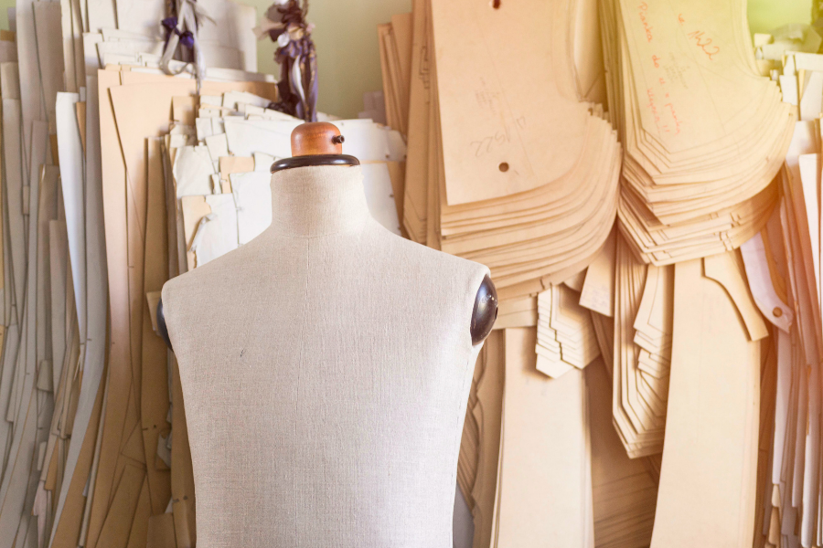
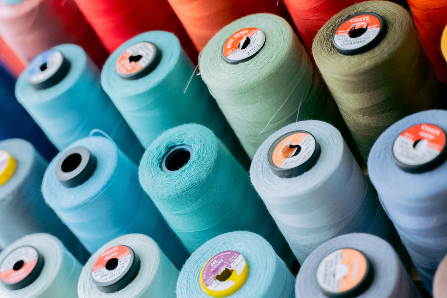
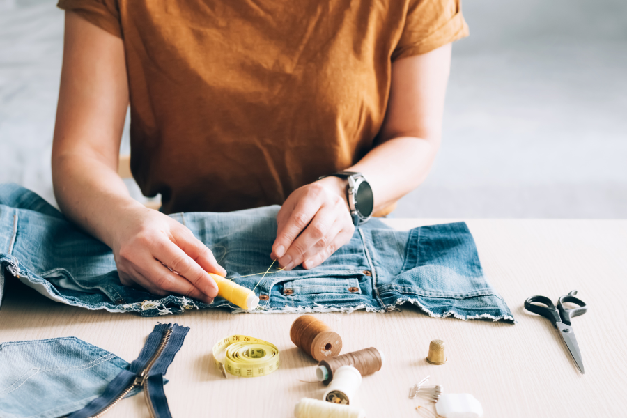
As a fabric enthusiast and seasoned sewing expert, I'll show you how to combine prints in your handmade wardrobe with confidence, style, and a dash of playful flair. Whether your vibe is street-style star or vintage queen, mixing prints is for everyone, especially if you love sewing, thrifting, or just standing out in a crowd. Ready to find your signature mix? Let's shake up those fabrics and patterns—fashion's about to get a whole lot of fun.

Why Mix Prints? Your Wardrobe, Your Rules
Mixing prints isn't about following rules—it's about embracing what makes your style you. When sewing your own clothes or curating a handmade wardrobe, you have access to patterns and fabrics most people only dream of. You're the designer, the stylist, and the trendsetter. Why settle for bland when you can have bold florals dancing with geometric shapes, or classic stripes making friends with retro checks?
When you start combining prints:
- Your outfits become one-of-a-kind: No two handmade pieces are ever exactly alike.
- You get to show off your sewing skills: Look at those pattern-matched seams!
- You make shopping—and getting dressed—way more exciting: Goodbye, boring basics.
Print mixing is more than a fashion statement. It's wearable self-expression—no magical fashion gene required.
Step 1: Pick Your "Hero" Print

Let's start with the anchor of your outfit: the star, the showstopper, your "hero" print. This is the boldest or most attention-grabbing pattern in your ensemble. Think:
- Giant, mood-boosting florals for dresses or blouses
- Statement-making stripes on a structured skirt
- Wild animal prints for a scarf or jacket
- Art deco geometrics for pants or a jumpsuit
Ask yourself: Which print do I want to stand out? Whatever catches your eye most in the fabric shop—or your stash pile—let that be the hero.
Example:
Imagine you've sewn a mustard-yellow blouse splashed with big, artsy blooms. This piece naturally pulls focus (and probably brings the compliments). That's your hero print. Everything else in the outfit will play a supporting role.
Step 2: Pair with a Subtle Print
Yes, you can mix polka dots with stripes—but unless you want to look like a walking optical illusion, it's all about balance.
A subtle print acts almost like a texture or a neutral. Think:
- Tiny black and white geometrics
- Miniature checks or micro-polka dots
- Faded ditsy florals on a low-key background
- Subdued tone-on-tone stripes
Your subtle print sits quietly in the background, letting your hero print shine without competing for attention. This is especially handy if you're easing into pattern mixing and want to feel chic, not chaotic.
Example:
Pair your vibrant floral top with trousers in a small-scale, black-and-white check print. The colors echo the grounding black and white, while the smaller scale keeps things balanced—not busy.

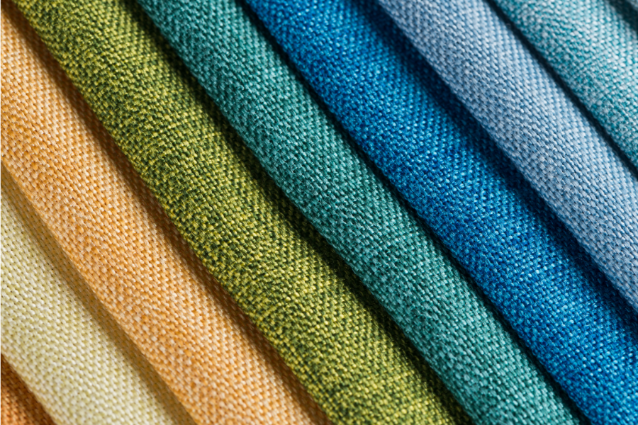
Step 3: Cohesive Color Is Your Secret Weapon
Ever seen a print-mixed outfit that somehow makes sense, even though the patterns are wildly different? That's color harmony at work.
When you're mixing prints, here's how to keep the chic factor high and the chaos low:
- Stick to a single color family: Blues with blues, earth tones with earth tones.
- Use neutrals to "calm" the mix: Black, white, gray, and navy pair effortlessly with bolder hues.
- Echo colors between pieces: If your hero print has a splash of green, pick up the same shade in your supporting print—or even your accessories.
The idea is to create a visual thread that links your prints together, making your outfit look thoughtfully pulled together.
Example:
Suppose your main floral is mustard yellow with blue and black accents. Choose a skirt in small black-and-white checks—it'll harmonize with the black, without fighting for attention. Or grab a navy-and-white striped scarf to pick up on the blue, tying the whole look together.
Step 4: Play with Print Scale
Print size matters! Mixing the same scale prints side by side can look harsh or overwhelming. The trick is contrast:
- Pair a bold, large floral with a skinny stripe or mini polka dot.
- Team a chunky plaid with a delicate vine print.
- Layer a wide, graphic stripe tee under a jacket in petite leopard spots.
Contr
ast in scale creates a visual hierarchy—your eye knows where to look first and where to "rest." This keeps your ensemble looking styled, not scattered.
Example:
Mix a dress in oversized palm leaves with a belt in tiny gingham checks for a dose of picnic-chic. It's the sartorial equivalent of putting Beyoncé and a backup dancer on stage together—they both shine, but one's clearly the headliner.

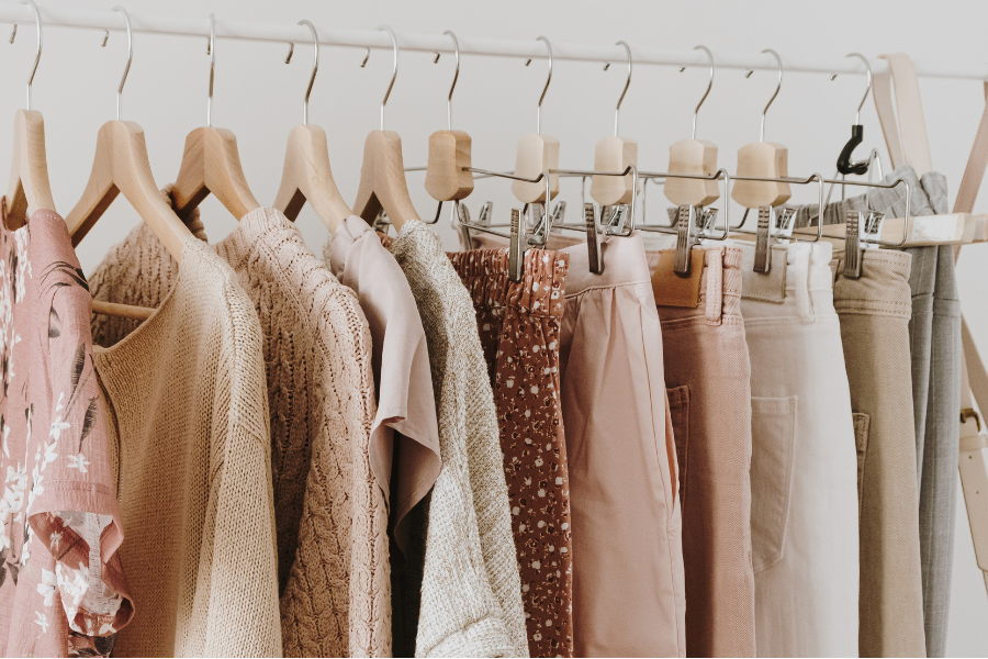
Step 5: Add Solid Colors as Breathers
Worried about going overboard? Solids are your best friends. Use them to break up prints, frame your mix, or give your eye a "breather" spot. Try:
- A solid cardigan, blazer, or vest over your mixed print base
- Solid color belts, shoes, or handbags to anchor the look
- T-shirts or tanks in neutral tones under bold-printed shirts or jackets
Solids keep the outfit grounded, letting your favorite patterns take center stage—without vying for all the applause.
Extra-Credit: Mixing Textures as Well as Prints
Level up your mix by combining different fabric textures, too. This is where handmade garments really get to show off:
- Try a crisp cotton stripe with a slinky rayon floral.
- Pair a tweed mini with a silky polka dot blouse.
- Mix faux suede pants with a lightweight, printed jersey tee.
Texture adds depth and visual interest. If you've ever paired a floaty chiffon blouse with sturdy denim, you already know the magic. Bonus: playing with texture is another way to tone down bolder prints if you're feeling shy.
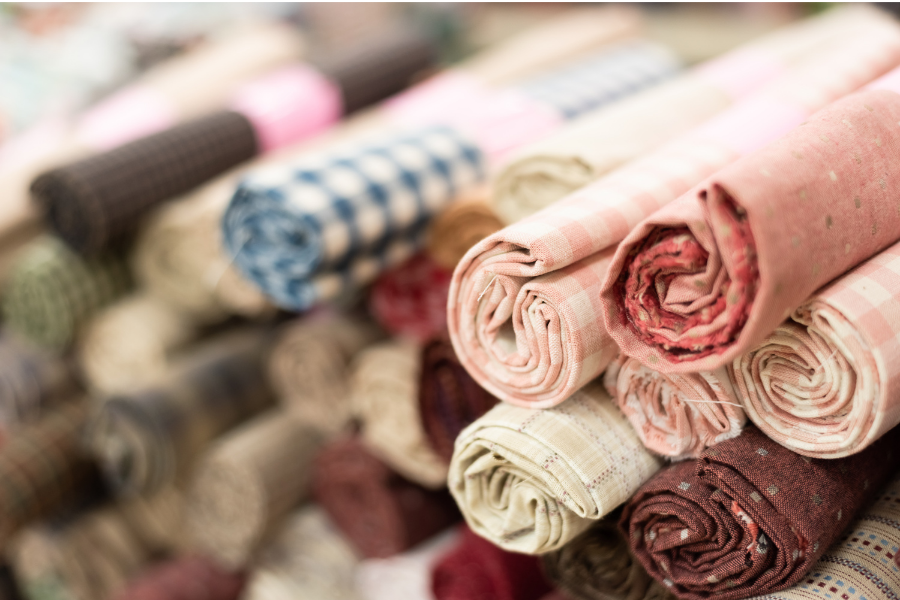
Common Print Mixing Pitfalls (and How to Dodge Them)
Before you head for the wild side of pattern play, here are a few "don't trip!" tips:
-
Don't Overdo It
Stick with two—three, max—distinct prints in an outfit. More than that, and you risk looking less "style icon" and more "lost in the laundry." -
Check the Fit
Busy prints + poor fit = instant fashion fail. Well-fitted garments always make patterns look intentional, not accidental. -
Mind the Mood
Mixing sweet, vintage florals with edgy geometrics? Make sure they vibe together—otherwise, your look might read as costume, not personality. -
Finish with Confident Accessories
Let accessories be the cherry on top, not another flavor in the sundae. A solid-color bag or shoe usually does the trick.
"But What If…?": Busting Print Mixing Myths
-
Can I mix horizontal and vertical stripes?
Absolutely—but vary the stripe width or color for best results. -
Can I match polka dots with florals?
If the colors connect and the scale is right, you'll look fresh, not frumpy. -
Can I thrift prints or use up fabric scraps from different eras?
That's the beauty of handmade and thrifted wardrobes—you can, and you should! Vintage prints paired with modern pieces = instant cool.
The Fun Part: Experiment and Express Yourself
Sewing and fabric shopping are playgrounds for personal style. If you're nervous about that first bold step, start small—maybe with a printed belt and a polka-dot scarf. Soon, you'll be pairing zebra with plaid and wondering why you ever stuck to solids.
Mixing prints lets you break the old "wear one pattern at a time" rule. It gives new life to fabric scraps, makes handmade clothes shine, and turns getting dressed into a creative act—like painting your own masterpiece, one garment at a time.
Stay tuned for more tips, fabric inspiration, and garment ideas from Sewing Studio.